And the winner is…
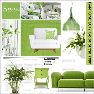
The 2017 Pantone color of the year has been announced and it is ‘Greenery’, or more specifically, Pantone 15-0343.
Getting a peek into the world of Pantone is what event producers and designers dream of! From their market making or breaking ‘colors of the year’, to their general usefulness when it comes to selecting a color to paint a backdrop or furniture, Pantone is an all-round event industry favorite when it comes to color.
So far their color of the year predictions have been pretty spot on.
For 2016 they named ‘rose quartz’ – a light, pastel pink, and ‘serenity’ – a baby blue, both of which have dominated runways & Instagram feeds.
But what I found most interesting was just how FAR in advance the color of the year is decided. Turns out, the special color (or colors, if 2016 is anything to go by) is selected two years in advance. Two years! Where can we find ourselves a Pantone trend forecaster to help us predict our future event designs?
The Vice President of Pantone Colour Institute, Laurie Pressman sheds some light.
“Color trend forecasting is being able to take a look at what’s happening now, what we see is going to be happening in the future and being able to ‘glom’ onto those key trends or leading trend indicators to see what the future looks like and what does that mean for color, because everything impacts color.”
Everything is color. I couldn’t agree more.

Greenery it is.
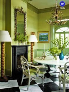
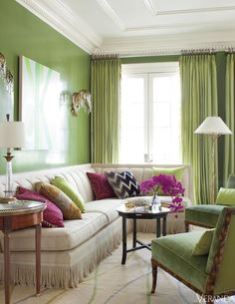
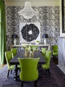
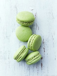
Greenery has been chosen for its’ “refreshing and revitalizing shade” and for being “symbolic of new beginnings.” Not just a food trend, Kale is predicted as one of the top Pantone colours for the year 2017. How cool is this? We could have an entire event built around Kale from finger food to green activities to event decor in a green ottoman, cushion or artwork.
“We refer to [Kale] as ‘oxygenating,’ taking a breath of fresh air. The world of architecture is also in on the trend given the breadth of vertical gardens, rooftop greenery and leafy plazas cropping up in new commercial buildings from New York to Dubai,” says Pantone Color Institute’s executive director Leatrice Eiseman.
“Greenery bursts forth in 2017 to provide us with the reassurance we yearn for amid a tumultuous social and political environment. Satisfying our growing desire to rejuvenate and revitalize, Greenery symbolizes the re-connection we seek with nature, one another and a larger purpose,” explains Beatrice Wiseman, executive director of the Pantone Colour Institute.
The company said the color “evokes the first days of spring when nature’s greens revive, restore, and renew. Illustrative of flourishing foliage and the lushness of the great outdoors, the fortifying attributes of Greenery signals event guests to take a deep breath, oxygenate, and reinvigorate.”
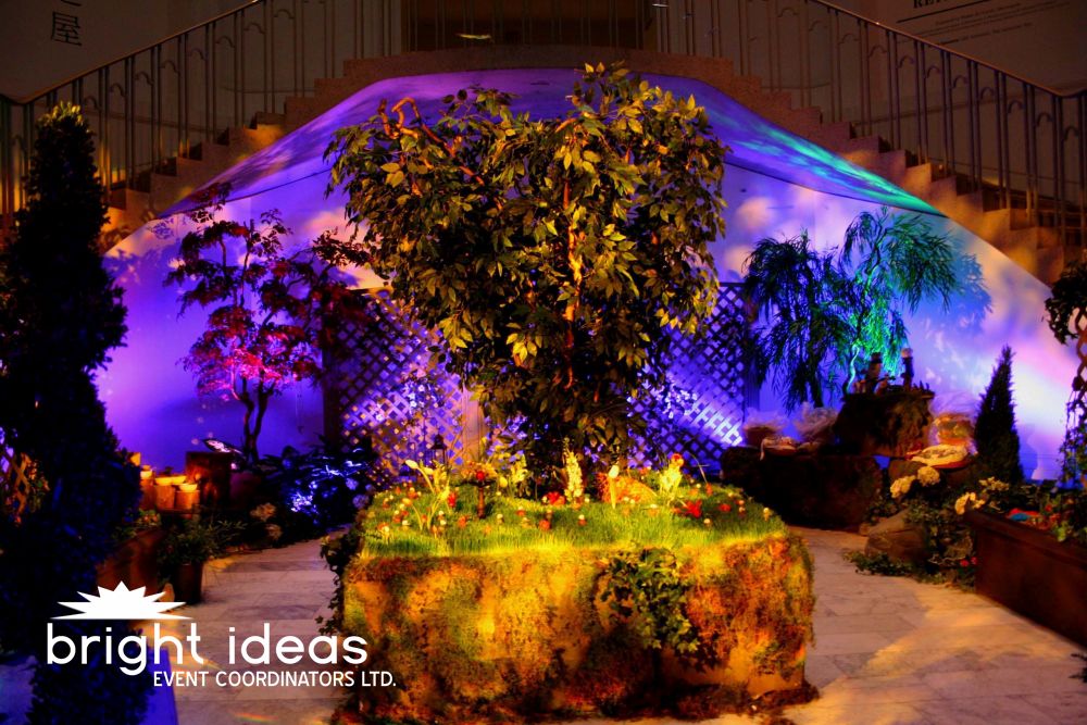
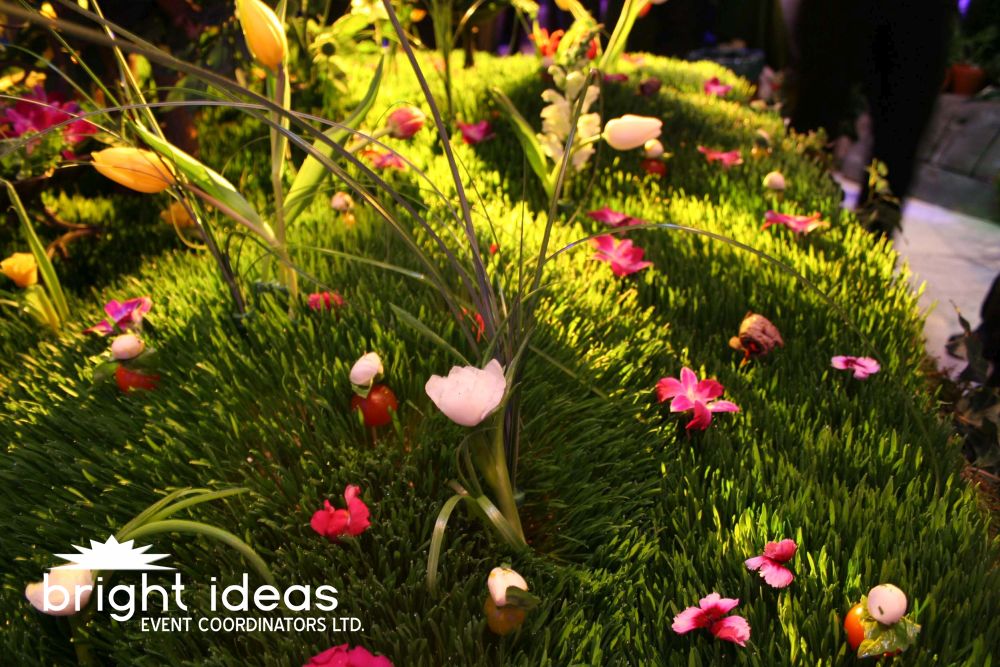
Pantone called the hue nature’s own neutral, something people crave as technology and modern life separate them from the basics. (Sound familiar?) Here is how we introduced nature into our award winning event – The Garden of Eatin’
~~~
You might also enjoy reading: